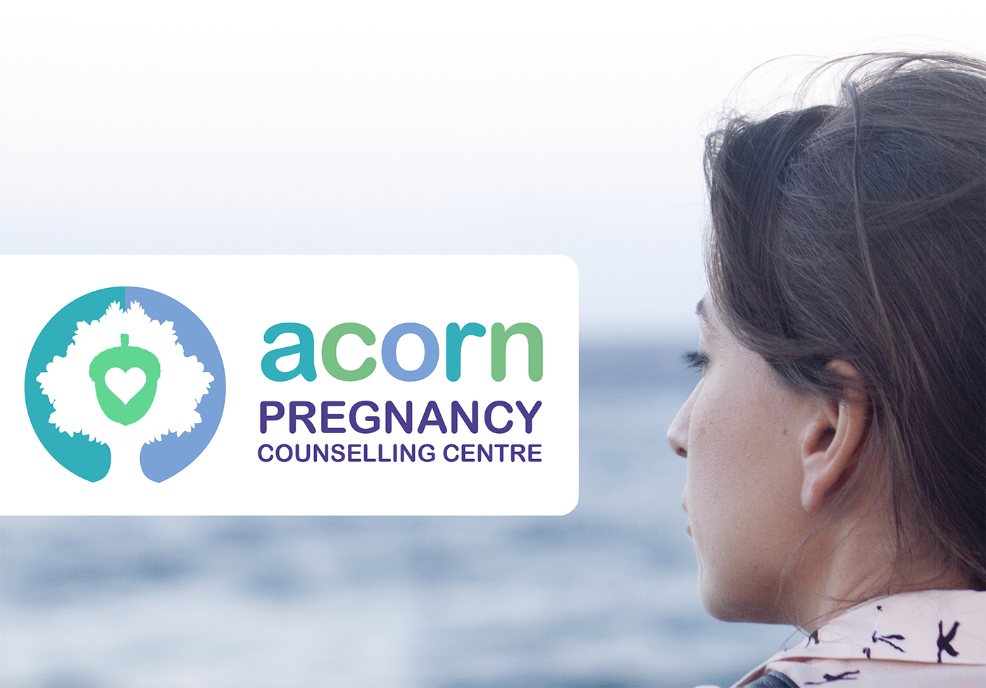
We designed a new logo for Acorn Pregnancy Counselling Centre.
Consulting and liaising with the team at Acorn, we were asked to create a brand that reflected the sensitive nature of the work and appealed to both clients and with the professional agencies they work alongside.
The logo is symbolic and has an acorn, tree and heart to represent the circle of life. The design was presented in three colour-ways. The final choice was greens and blues. The acorn title is shown in different complementary colours to represent their client’s individuality and diversity.
Mint have been asked to continue to work with Acorn to re-brand and design new literature and website.


